
The Brand Catwalk - Dorset Cereals

Gold Hill in Shaftesbury, Dorset. Location for THAT ad. Image courtesy of Andy Latt
I don't know what I love most about the uber premium breakfast cereal brand, Dorset Cereals - the idea, the product, the packaging or the online experience. So you are just going to have to endure me whittering on about all of them.
![]()
How many brands carry the name of a place they have absolutely nothing to do with? That adopt some mock provenance as a result of a particularly over active brainstorm. Well not Dorset Cereals.
Dorset Cereals are actually, er made in Dorset. The factory is near Dorchester to be precise and not far from the Prince of Wales' ghastly architectural confection, Poundbury. Which is where the brand started life way back in the late '80s.
However, our story starts in 2005. This is when the worthy but rather dull Dorset Cereals brand was acquired by a management buy-in team backed by the private equity firm, Langholm Capital.
And the result has been astonishing, especialy given the bad press that the private equity sector has been getting recently in the UK.
Before its new lease of life Dorset Cereals was the museli of popular imagination. It enjoyed a twee wholefoods identity, bog standard bulky cellophane packs (that looked like they contained dried dog food) and the standard muesli portfolio of super, deluxe and luxury products - long on hyperbole but rather short on appetite appeal or differentiation.
What happened then just goes to show how far a little imagination, ambition and creativity can go.
To be honest I'm not sure to what extent the recipes actually changed, these were always good quality products with real authenticity. But boy oh boy do they sound good now - like berries and cherries or super cranberry. And in addition to the Mueslis (which also come in cute variety packs) there is also a fantastic range of fruity porridge.
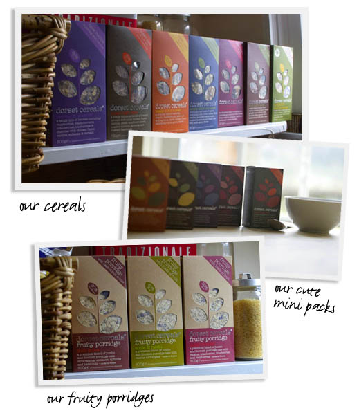
However, the hero of the hour is without a doubt the packaging. if there is ever going to be cereal packaging you want to display in your kitchen rather than stuffing into a cupboard, this is it. Cheerios they are not.
It is the shape of the boxes (squat and chunky), it is the flat secondary background colours, its is the typewriter typeface, it is the cereal shaped window onto the product and it is the sheer quality and feel of the cardboard (seriously), that make the packs as visually edible as the product.
The alliance of product quality, authenticity and packaging prowess screams out "I am justifying my price premium like you wouldn't believe".
And it doesn't stop there.
We talk alot about digital natives - the people for whom a digital life is instinctive because they have know no different. Well maybe we are seeing a bunch of brands emerging that are themselves digital natives, born (or in this case reborn) into a digital brandscape. And Dorset Cereals might just be one of them.
The online experience (designed by Big Fish) is built round a brand position that our greatest pleasures are life's simple pleasures. And to support this they offer us a simple pleasure to enjoy every single day of the year.
As I write they are celebrating World Book Day, with links to thebookguide (a comprehensive guide to sources of secondhand and antiquarian books)and readitswapit.co.uk that helps people swap books they have finished with.
And that is just today, yesterday's simple pleasure was the humble Primrose.
Infact what they are up to almost counts as a brand led community, with Dorset Cereal fans uploading photos of their own simple pleasure and a whole host of offline activities to get involved in.
Oh and the cereal tastes bloody brilliant too.
And as for success, well is not easy to figure out how sales are doing, but distribution is impressive and exports are going gangbusters, with 25% of production leaving these shores. This little taste of Dorset can be bought in no less than 60 foriegn markets which led to Dorset Cereals being given a Queens Award for Enterprise last year.
Dorset Cereals - a small change, a big difference and a dynamic micro brand fit for purpose in today's brandscape.
Comments
I agree about the packaging, and I love the website. Nice work DC.
Posted by: Will at March 1, 2007 04:07 PM
I don't find the packaging attractive at all. Feels very 2000. It doesn't communicate nor justify a premium price to me and it looks more like pasta – Still I want it. How does it come? :-D
I would like to see cereals packaged in the same design as the cover for Phaidon/Rose Bakery's 'Breakfast Lunch Tea' http://ec1.images-amazon.com/images/P/0714844659.01._SS500_SCLZZZZZZZ_.jpg (bad pic) Just love the old touch to it and the badly typed titles. Looks very premium in a strange way. Guess you need some touch and feel to experience it.
Posted by: MLVR at March 2, 2007 12:51 AM
I've never seen or tried the product - but then I'm not a big shopper ;)
But the screen saver is awesome!
Posted by: Faris at March 3, 2007 01:37 PM
I think it's a great brand and a better than great product.
I also liked the fact that you could buy direct from their website and that they had all sorts of trial sized packs to buy that you could not get anywhere else.
Posted by: amelia at March 5, 2007 02:11 PM
I've just discovered Dorset Cereals and I'm totally sold on them! Great packaging and delicious wholesome cereals with real flavour and goodness. Am now looking forward to trying diferent types within the brand.
Posted by: Jan Milligan at March 11, 2007 06:11 PM